VIP member
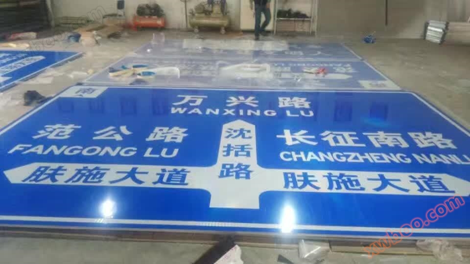
Yan'an Fushi Avenue Sign
The relationship between signage design and key elements: 1. Signage and speed. People's vision changes at different moving speeds, and the faster the
Product details
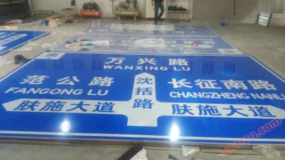
The relationship between signage design and key elements
1. Signage and speed
People's vision changes at different speeds of movement, and the faster the speed, the more their visual acuity decreases when looking at objects within their field of view. The specific amount of visual impairment needs to be verified through experiments, and if standard specifications are to be developed, a large number of experiments and investigations must be conducted for verification. 2. The shape of signs, especially traffic signs, must comply with national or international standards. In the absence of standard specifications, attention should be paid to the principles of easy identification and non similarity (preferably uniqueness).
According to human factors experiments, the larger the sign under the same line of sight, the shorter the recognition time for humans. Conversely, the longer the recognition time, and the size setting depends on how long we expect to complete the recognition. Of course, the first prerequisite is that the size is visible to normal human vision at the farthest point of the set line of sight. On highways, vehicles travel at high speeds and drivers must complete identification in a very short amount of time, so highway signs are much larger in size than signs on general urban roads.
There are rules for how many words, symbols or patterns to write on a sign. Firstly, the size must be visible, and secondly, it must be read within the expected recognition time.
The clarity of a sign is closely related to the color used. When looking at a sign of the same size at the same line of sight, the color of the sign's background and the text symbols on it may vary greatly in terms of visibility and how long it takes to recognize them. Generally speaking, the higher the warning level, the brighter the colors used, and the greater the color contrast.

Online inquiry
-
Contacts
-
Company
-
Telephone
-
Email
-
WeChat
-
Verification Code
-
Message Content
-